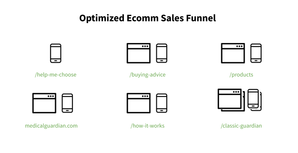
Key Business Goals:
Reduce cost post per sale to increase profit
via increased web orders over phone ordersIncrease lead generation
via Risk Assessment WidgetEducate both customer segments: the end user and family
via curation of valuable written and video content
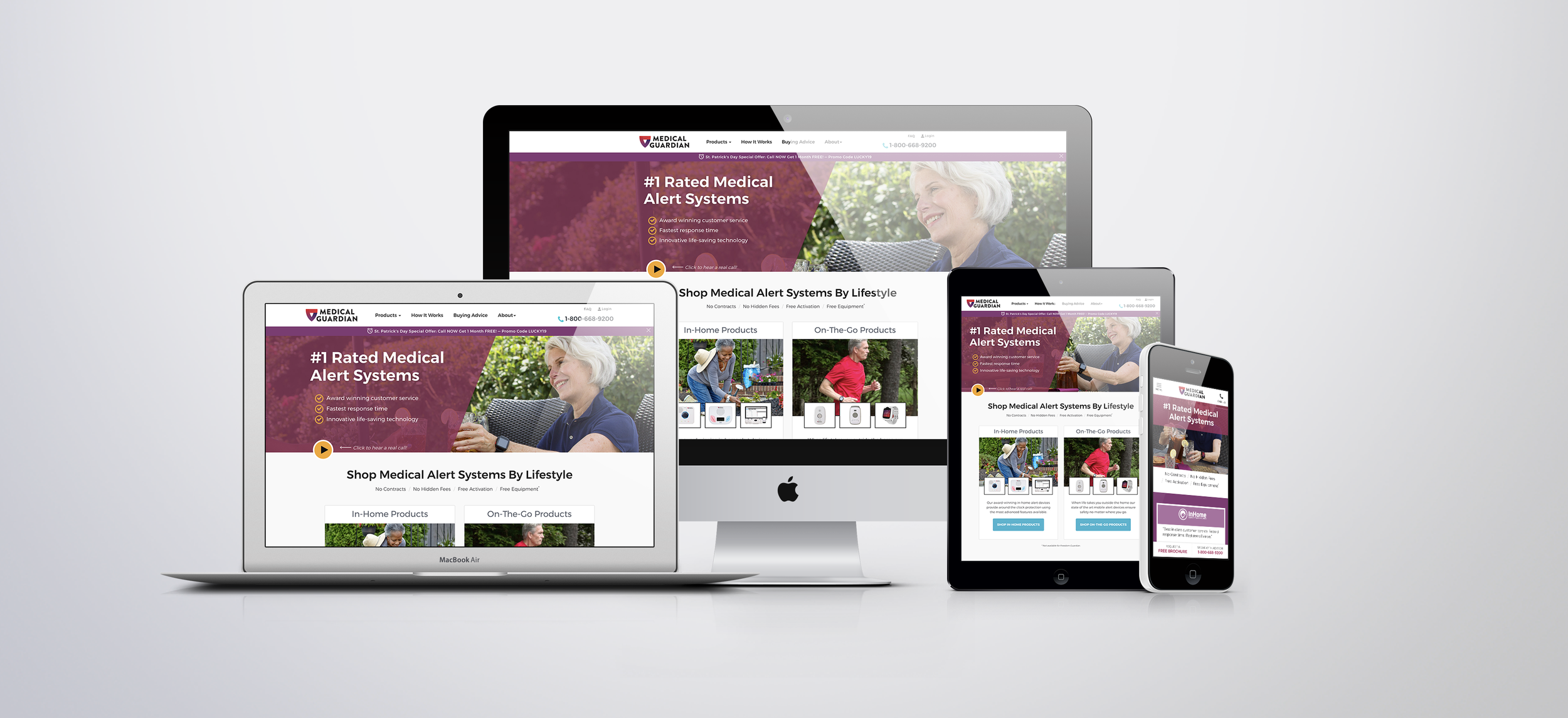
Medical Guardian provides affordable and reliable medical alert devices and emergency call center support services to those looking to live a life without limits. Products are merchandised to fit the user’s lifestyle from the in-home system, mobile devices or wearable medical alert smartwatch. Call center support services contact dispatch for emergency responders and the end user’s personal contacts in an emergency.
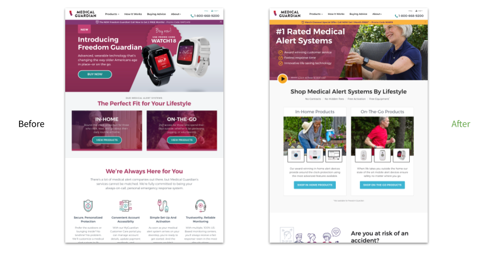
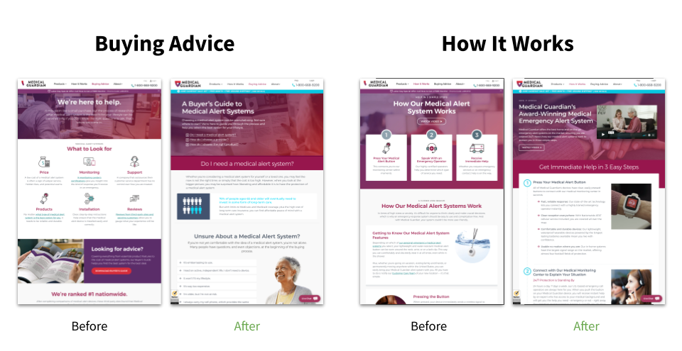
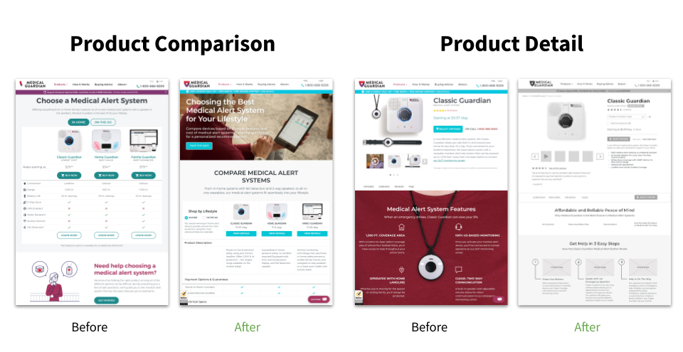
The majority of sales were being made over the phone by Sales Reps, which was costing the business more than it should have with a functioning yet underperforming ecommerce site. In response to these high sales costs and intense market competition, the organic homepage and site as a whole needed an information design overhaul. Users needed an experience that would allow them to effortlessly assess product features, add-ons and the quality of emergency dispatch services to internalize Medical Guardian’s value propositions and make an online purchase. The online shopping experience would have to target the end users of these devices AND the caregivers/family members.
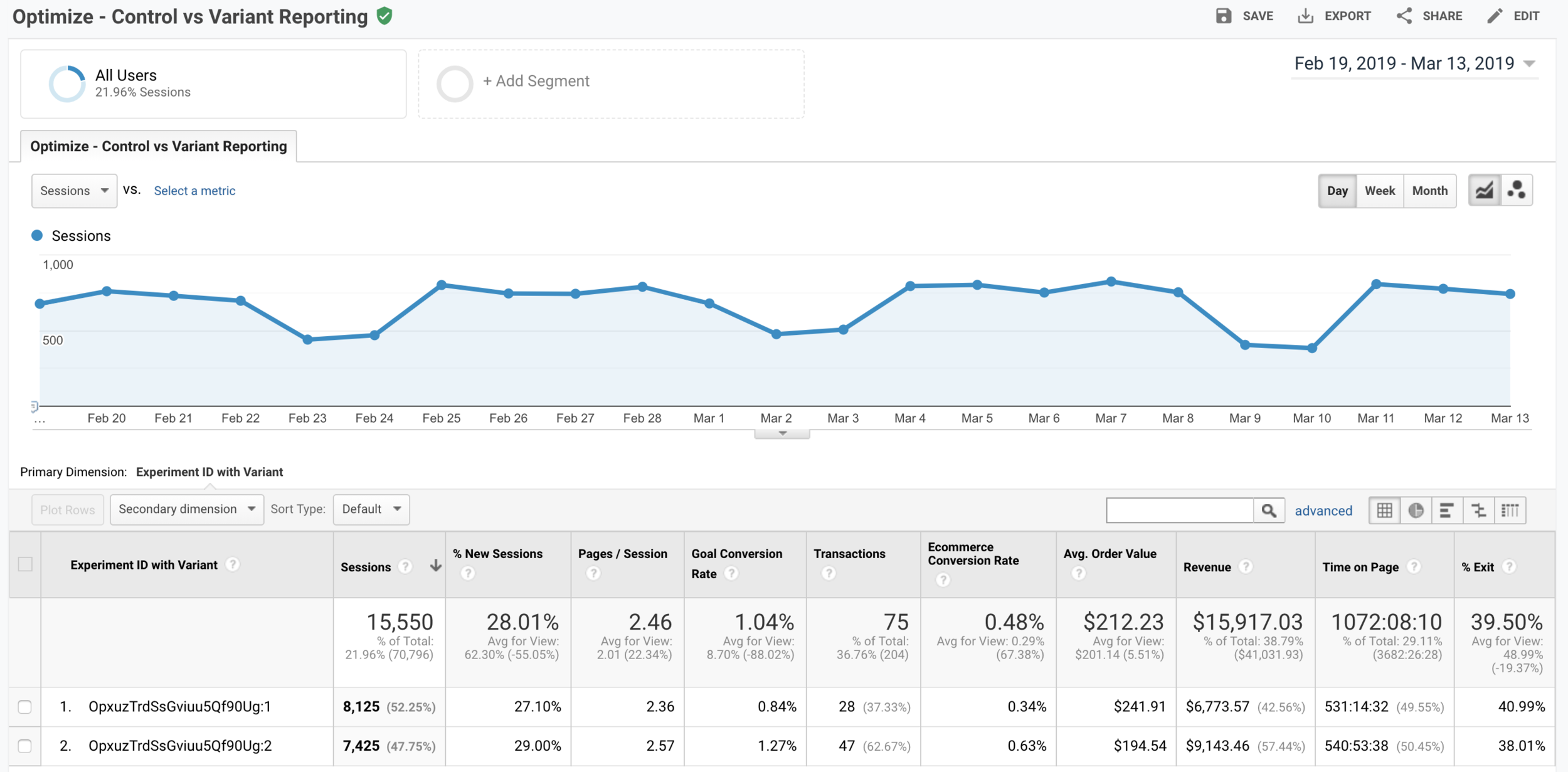
Through multivariate A/B testing we incrementally increased conversions from top to bottom of the funnel. Some initial wins included increased conversions by 25.3% across all product detail pages and increased conversions by 7.7% within checkout. Most notably, after a full intensive homepage redesign we successfully increased conversions by 95% while simultaneously lowering the volume of phone sales. As a result, we lowered the cost per sale and nearly doubled revenue. This new level of conversion performance was made possible by (1) strategic UX research analyzing diverse qualitative and quantitative data sources, (2) the strategic integration of CRO principles: social proof, scarcity, and urgency, as well as (3) the definition of accessibility guidelines for improved site-wide usability design. My client was collecting a +3,000% ROI with +$1.6M in annualized revenue at only a quarter of the way through our roadmap of enhancements.
UX RESEARCH - QUAL+ QUANT DATA ANALYTICS
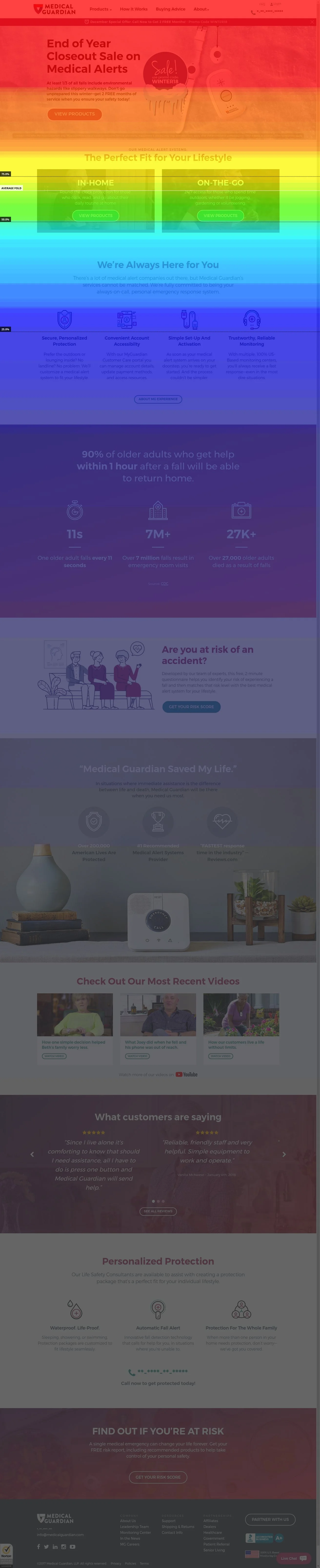
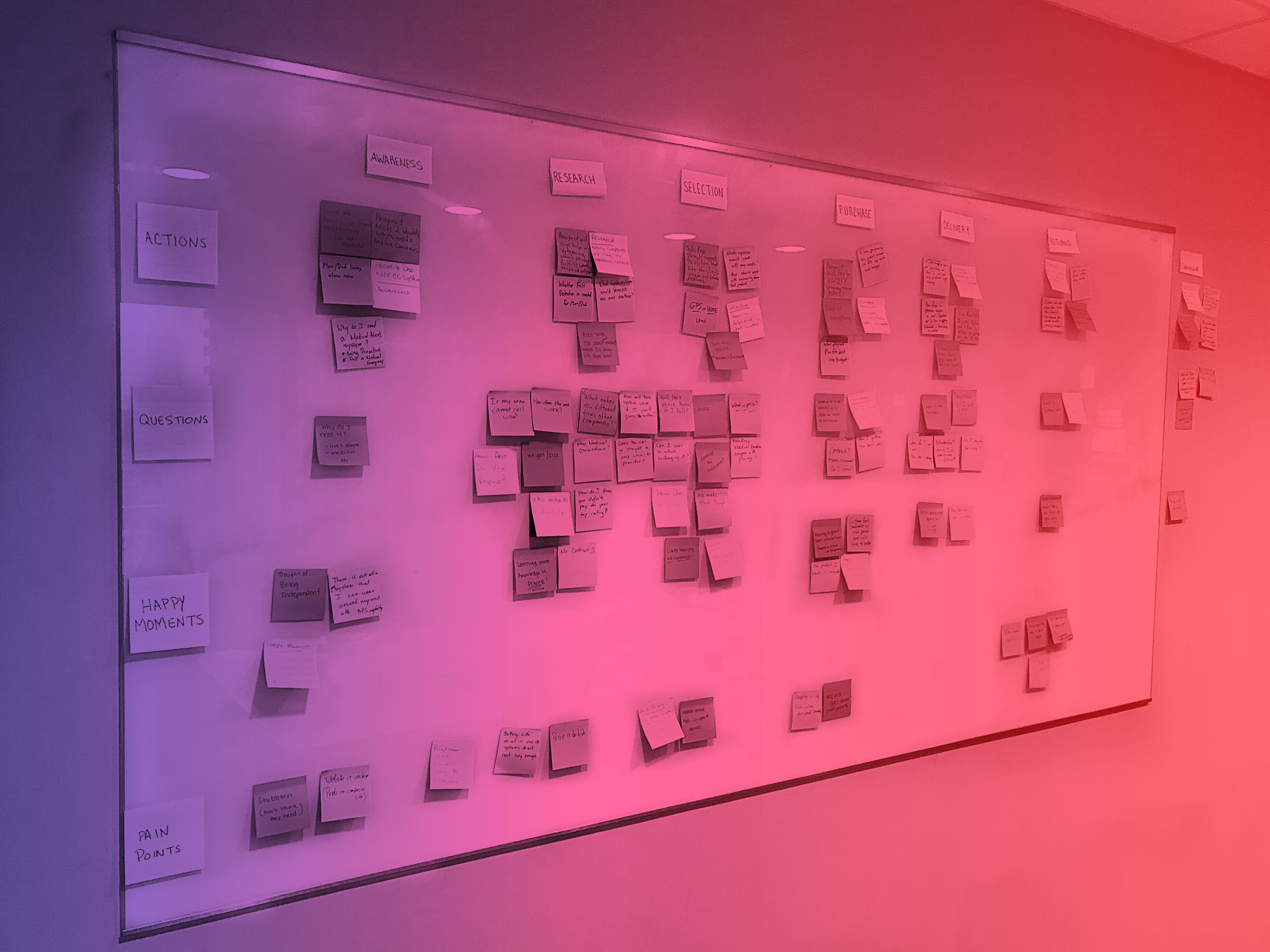
By heavily investing resources into researching our users and the competitive market we were able to deliver results far above our baseline projection. Leveraging diverse data inputs allowed us to get a well rounded understanding of where the current experience was working vs failing. We developed a massive backlog of enhancements by defining clear insights from this research that would feed our testing pipeline for over 6 months.
Methods Employed:
HotJar Heat Maps and Scroll Maps
Google Analytics User Behavior Data
Remote Unmoderated User Testing
User Journey Mapping with Sales Reps
Accessibility Guidelines for Usability Best Practices [not pictured]
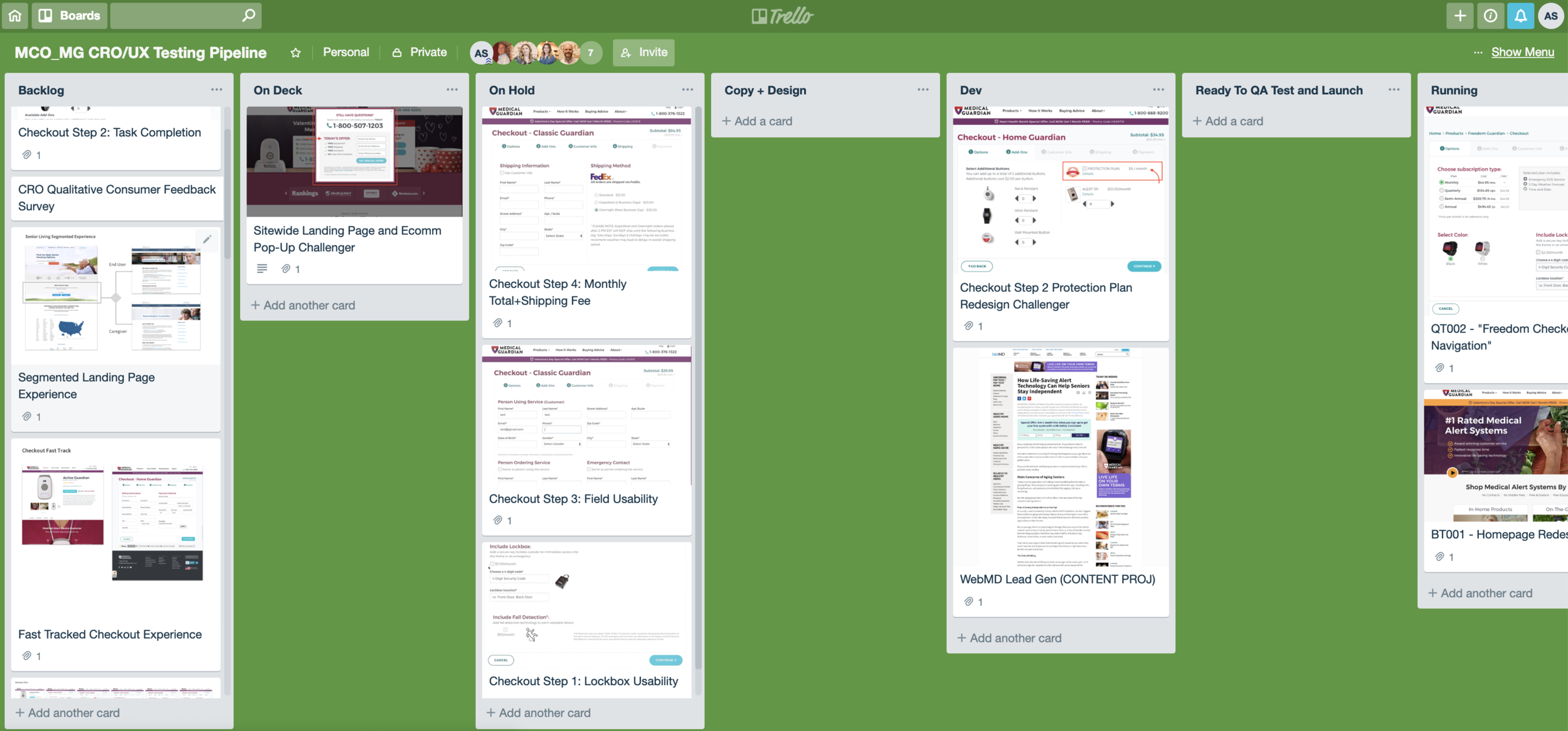
CRO / UX ROADMAP - A/B TESTING PIPELINE
As Lead UX and CRO Strategist I head up the strategy, management, and execution of our test pipeline that feeds the marketing roadmap aligned with key business initiatives. I use the Kanban method to provide all stakeholders a simplified view into our work. Tests are organized to instantly communicate backlog priority and in-flight test status.
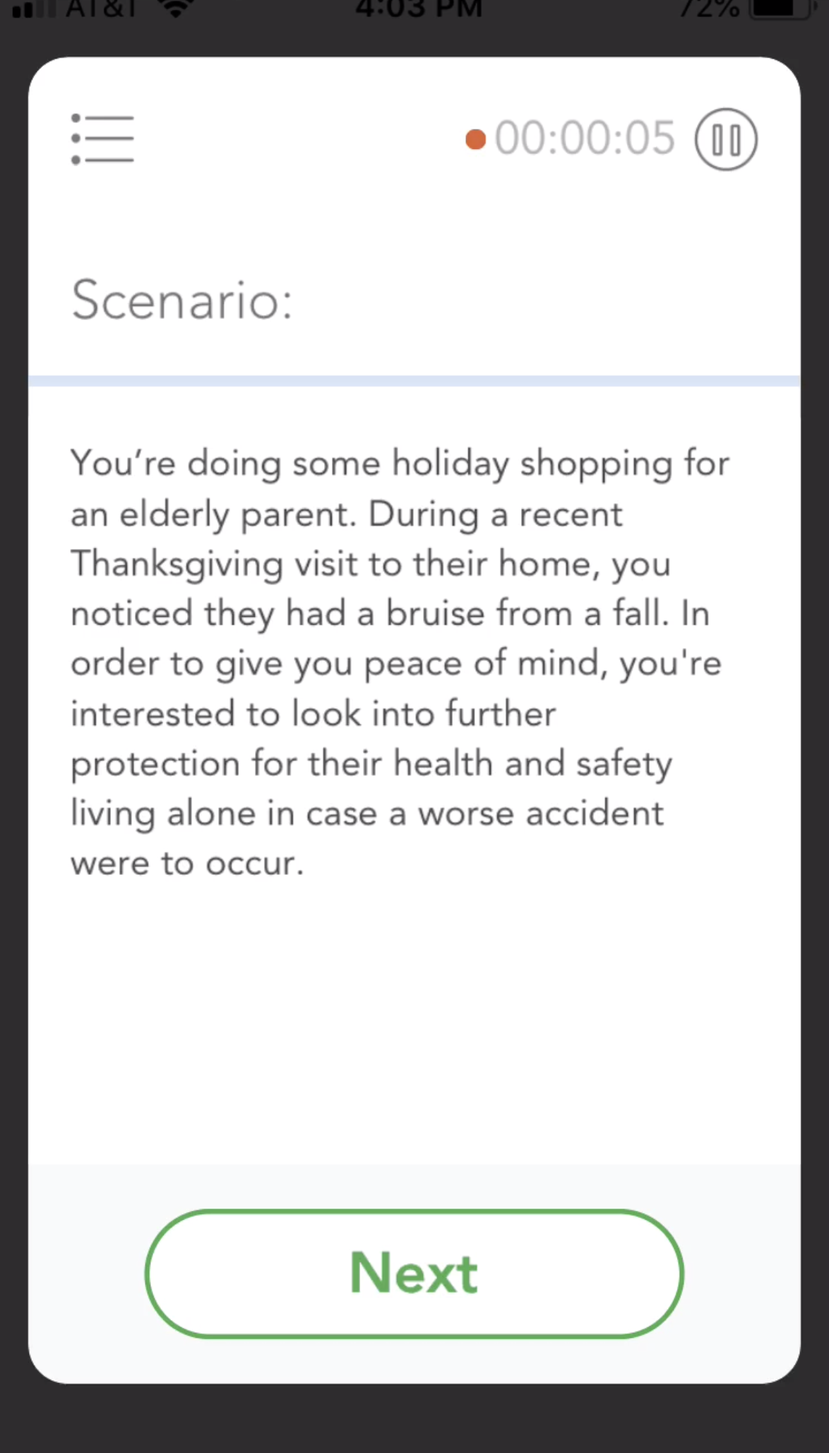
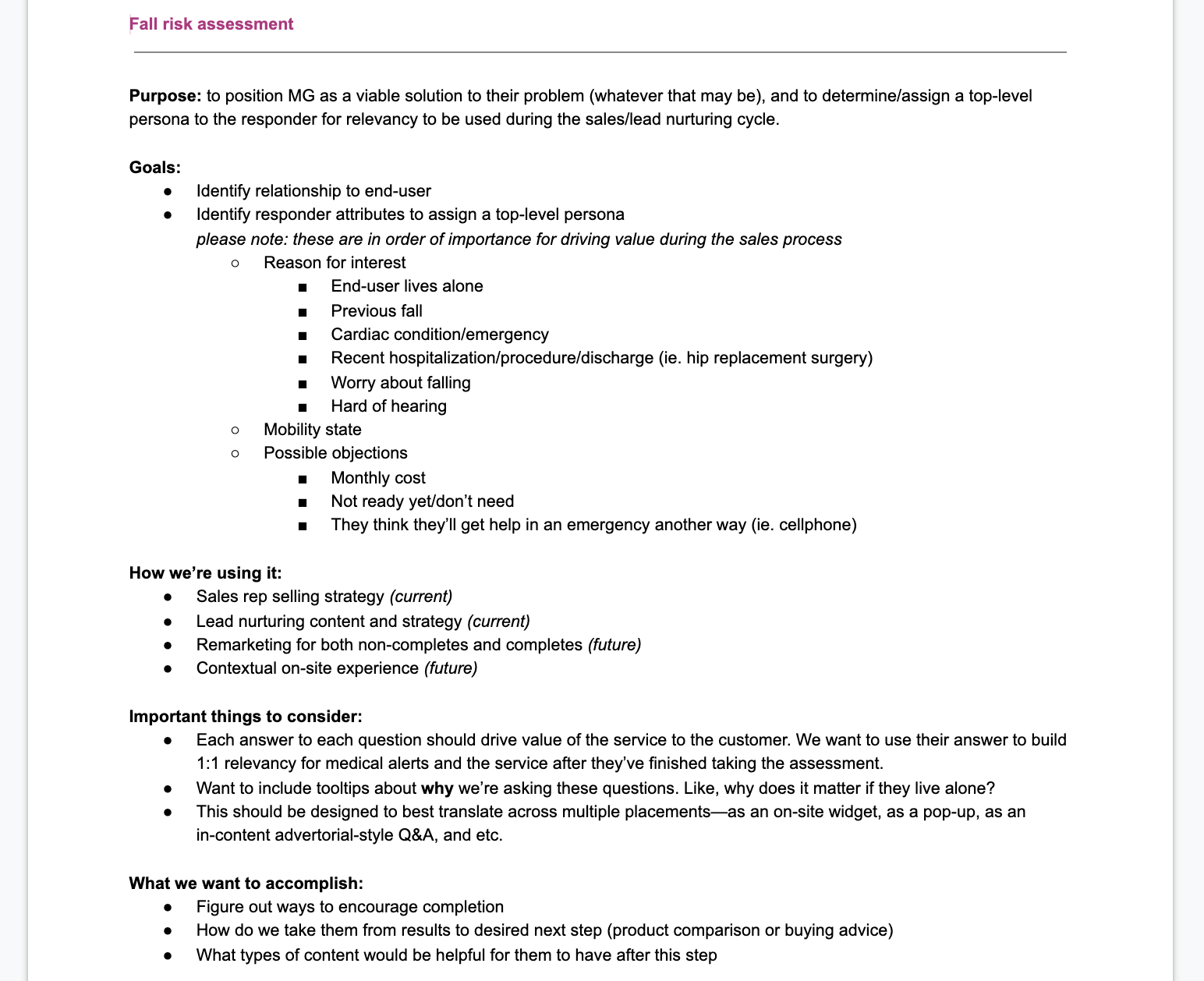
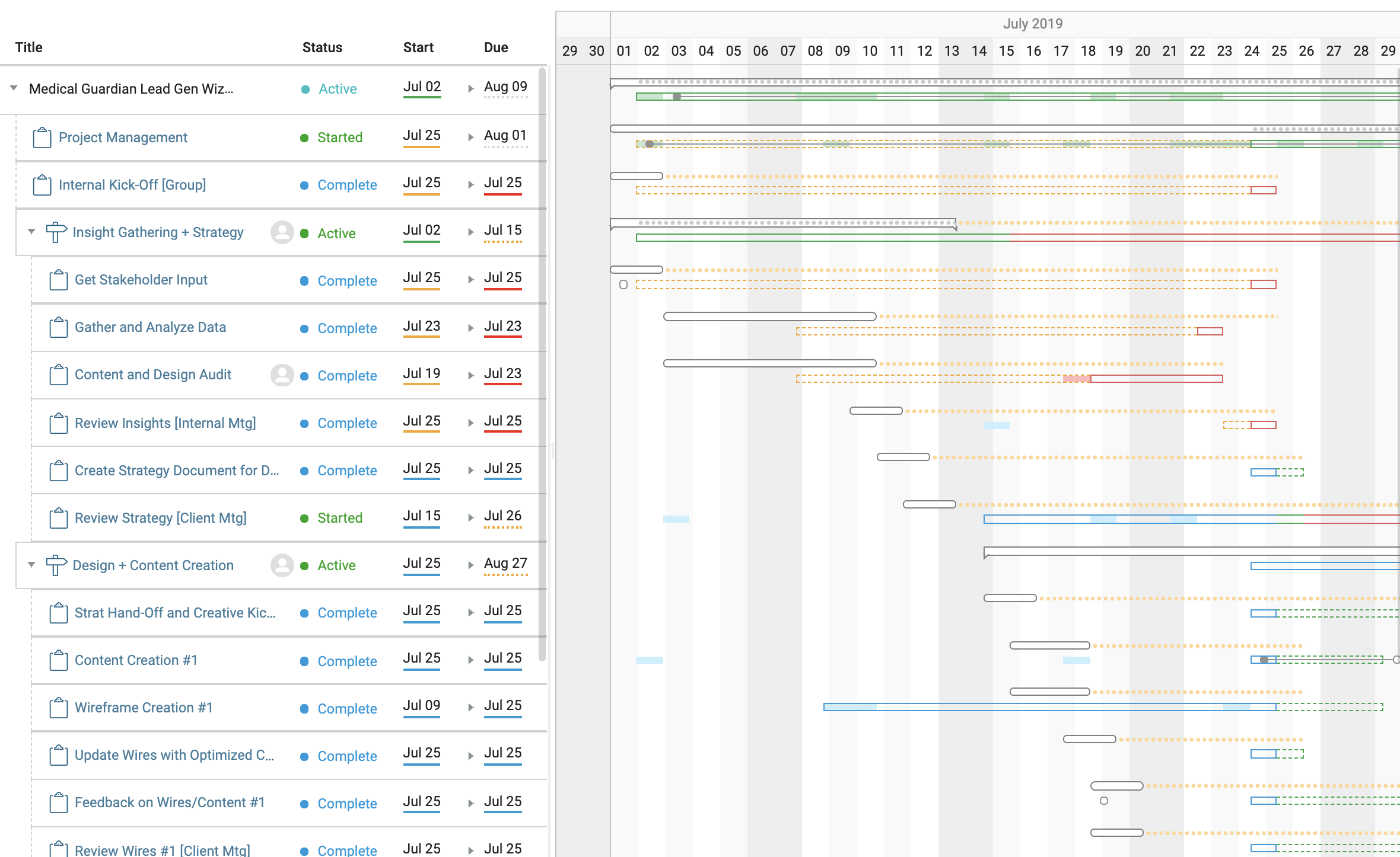
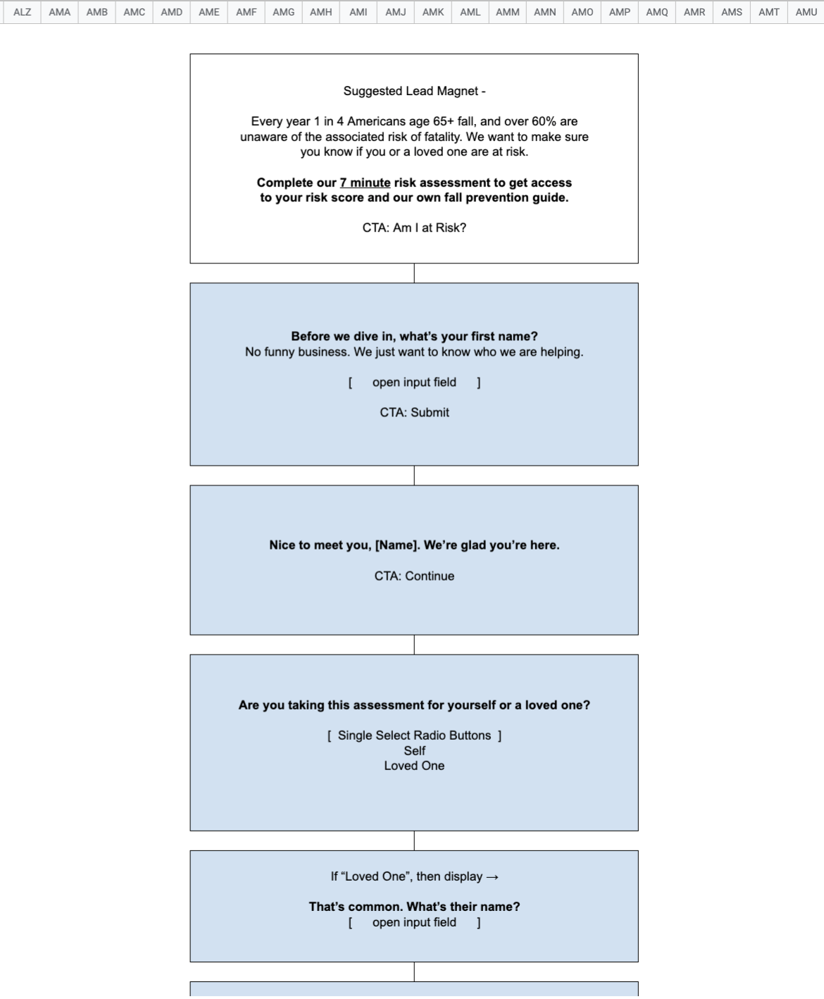
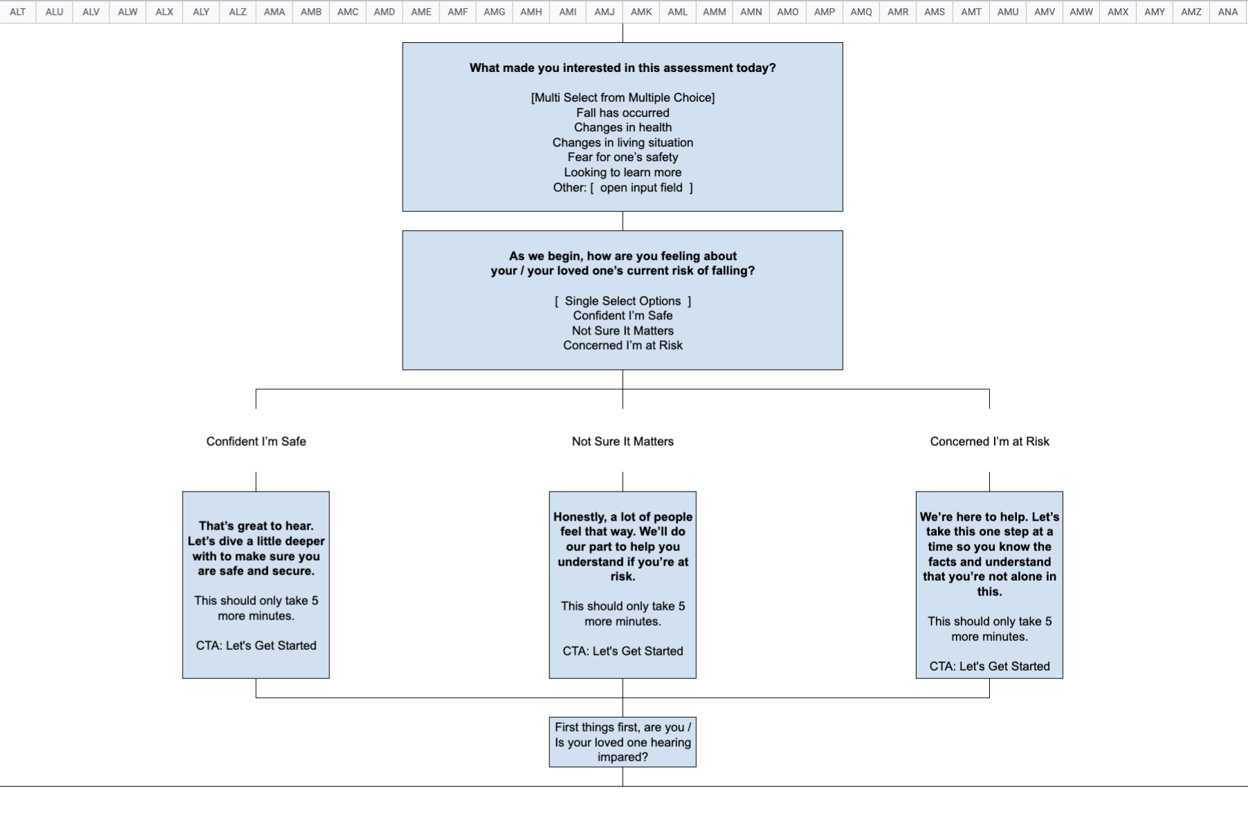
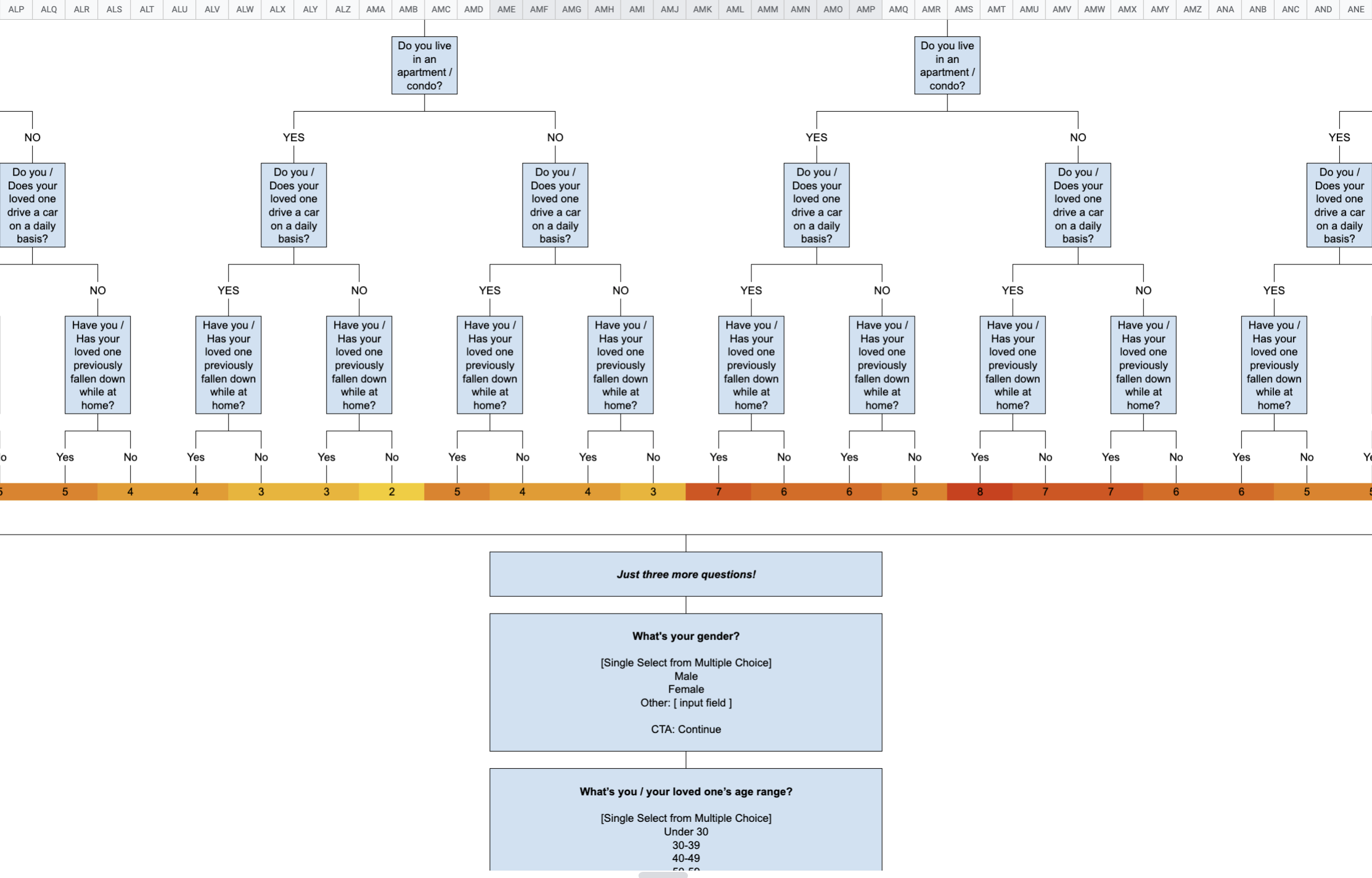
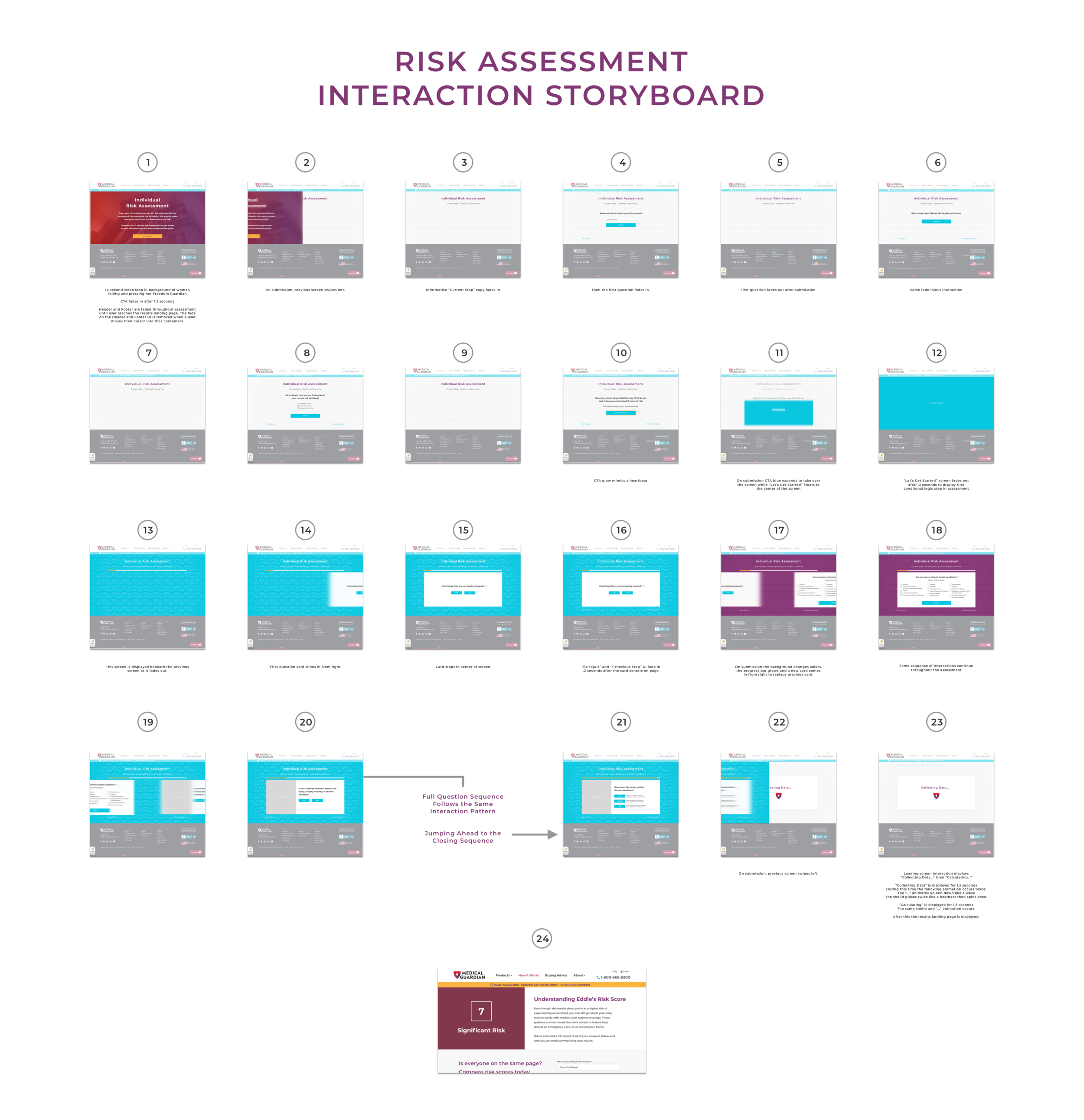
INTERACTIVE PRODUCT DEVELOPMENT - LEAD GENERATION WIZARD
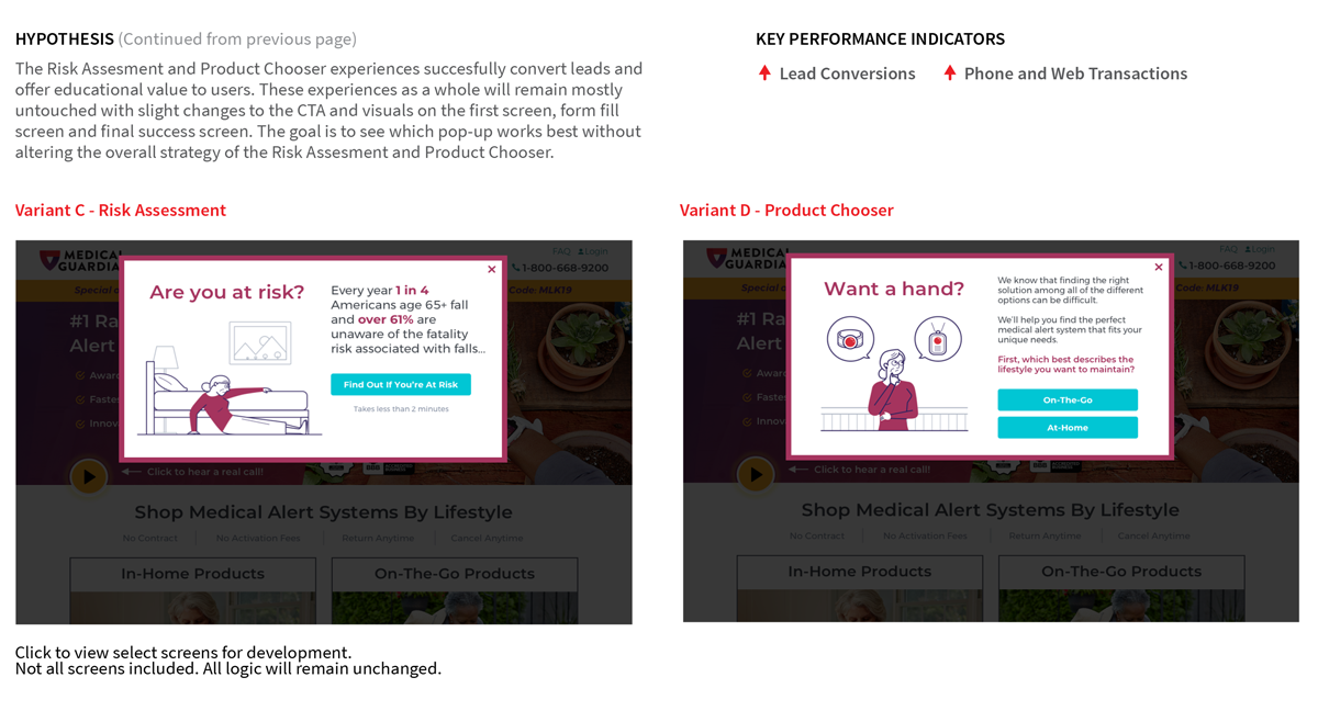
The project below involved the full reconsideration of a top-of-funnel lead generation wizard or quiz. The goal was to provide the user with an immersive and educational experience that empowered users to send their family members the same assessment in order to encourage engagement between all crucial personas involved in the purchasing process. The hypothesis is that this will generate higher quality leads for the sales team. The recommended UI applies top usability principles to assist task completion and build off of the current global design patterns. The recommended interactions are targeted to be intuitive, create intrigue, heighten user focus, and humanize Medical Guardian's brand. I managed and executed every step of this process. The imagery below illustrates the various tools and documentation used to deliver this project on time and on budget. This is currently being developed and will be launched soon.
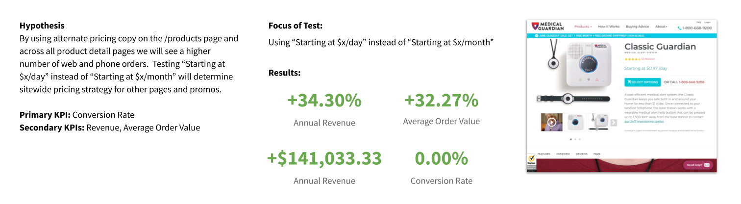
CASE STUDY - PRODUCT PRICE TEST
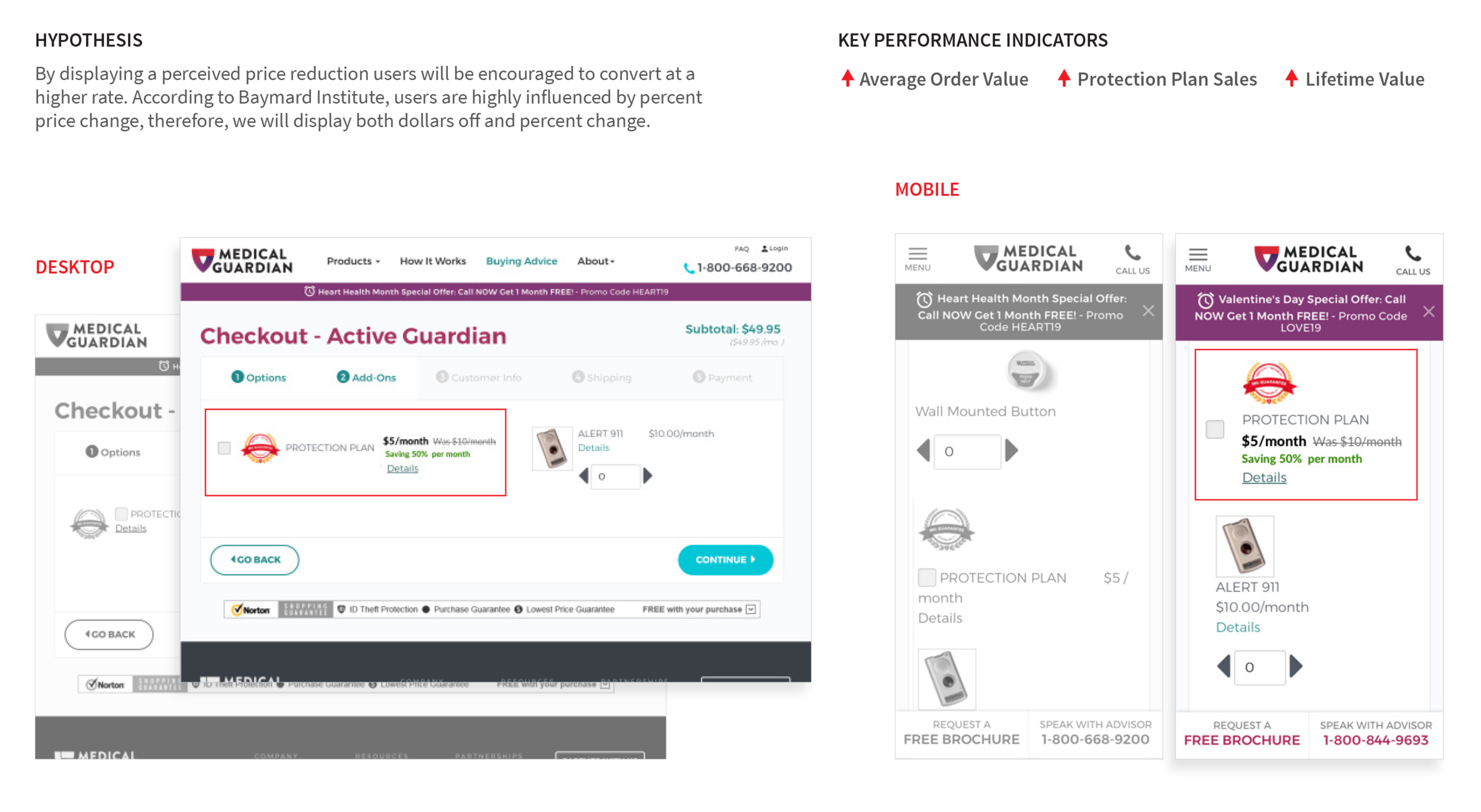
CASE STUDY - PROTECTION PLAN PRICE REDESIGN TEST
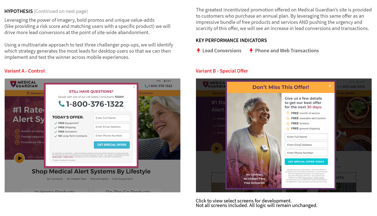
CASE STUDY - LEAD GENERATION ABANDON POP-UP CHALLENGER
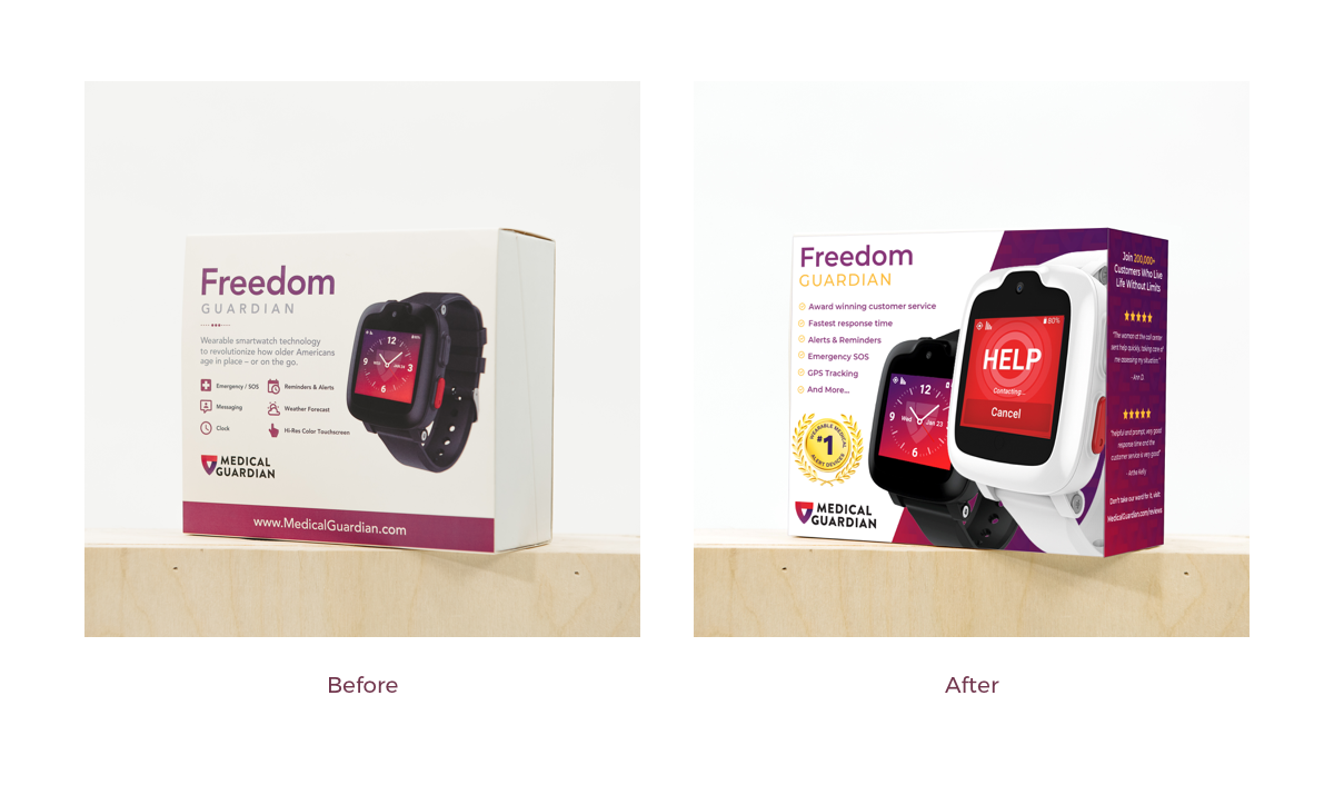
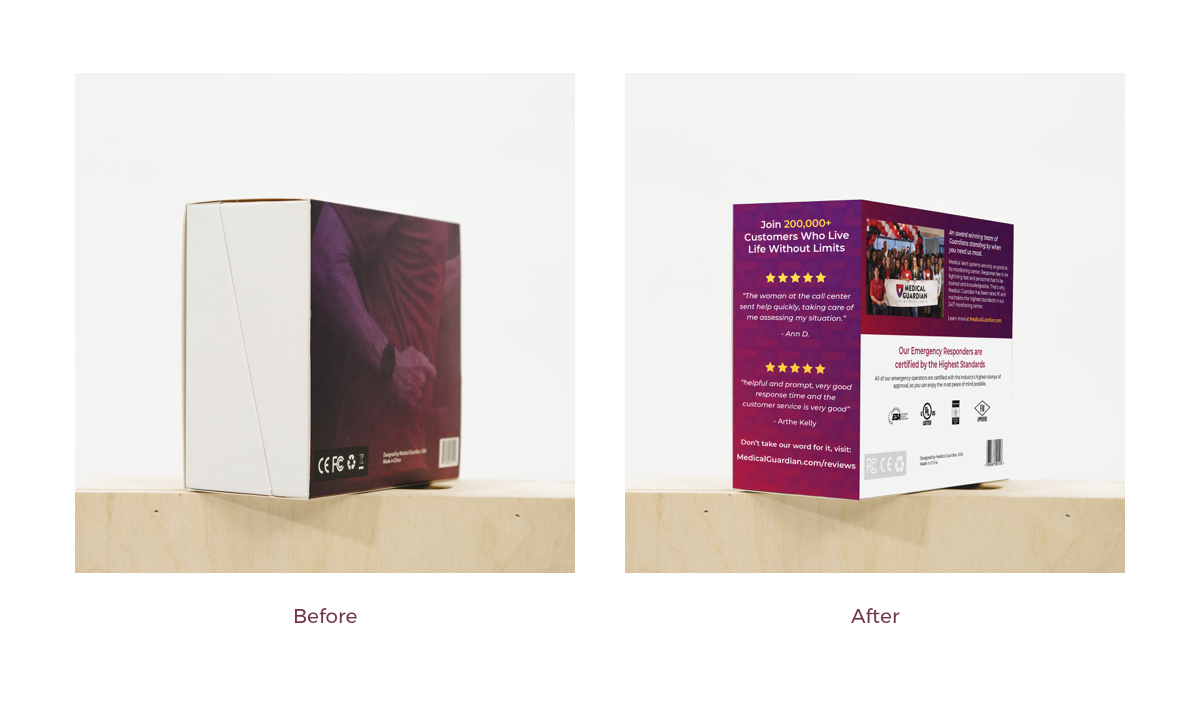
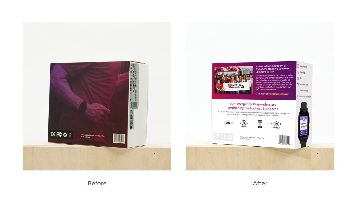
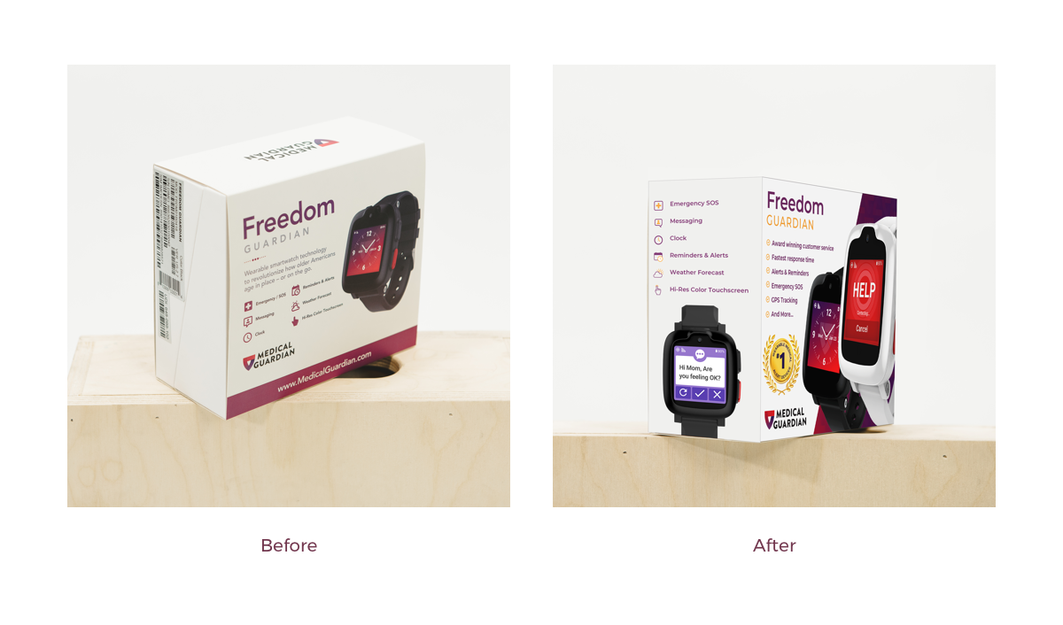
CASE STUDY - In-Store Packaging Design
Goal: Redesign the product packaging that the Medical Guardian team originally designed for ecommerce business to educate and sell the product more effectively, making this love at first sight for in-store shoppers.
Background: The Medical Guardian team worked hard to get onto the shelves of stores like Walmart and needed this sales channel to be a HUGE success. In any store there are hundreds if not thousands of products all competing for consumers’ attention. The only way to set Medical Guardian’s brand apart was to be different, to be authentic. We needed to effectively educate and sell the product to unfamiliar customers. Since after all, 70% of purchasing decisions are made in-store.
Result: Using insights from our successful homepage redesign and package design expertise, the new packaging of the Freedom Guardian communicates the brand’s originality, character and memorability to increase in-store conversions.